Part 1 | Part 2 | Part 3 | Part 4
Table of Contents
Claro's bright future
--Rethinking the layout of administration pages
--Simplifying complex user interfaces
--A dream state for Claro?
--Why Drupal is a perfect place for UI development
Conclusion: How to get involved
Drupal has seen a range of administrative experiences over its history, starting with early Drupal mainstays like the Garland theme and Seven, perhaps the most recognizable iteration of Drupal's editorial experience in its history. Recently, another administration theme joined the pantheon of administration themes in Drupal core that have had an outsized influence on how users interact with Drupal not only for the first time but for countless times afterwards. The Claro administration theme is a new theme for Drupal 8, now available in Drupal core, which offers a more modern user experience thanks to its emphasis on usability and accessibility during the design and development process.
A short time ago, Cristina Chumillas (Claro maintainer and Front-End Developer at Lullabot), Fabian Franz (Senior Technical Architect and Performance Lead at Tag1) and Michael Meyers (Managing Director at Tag1) joined your correspondent (Preston So, Editor in Chief at Tag1 and author of Decoupled Drupal in Practice) for a wide-ranging conversation about why Claro is such a compelling new addition to Drupal's editorial experience and how Claro focused on enabling accessibility and user experience outcomes that would permit a narrowly scoped development cycle while also yielding the potential for a variety of other initiatives to extend Claro's design to encompass other use cases. In this multi-part blog series, we explore some of what we learned during this Tag1 Team Talks episode. In this fourth and final installment, we unlock some of the features ahead in Claro's roadmap and share how you too can contribute to the exciting future ahead of the Claro theme.
Claro's bright future
Before we proceed, if you have not yet taken a look at the first, second, and third installments of this blog series on Claro, I highly recommend you do so to better understand some of the context behind the history of Claro, the motivations behind a new administration theme, some of the data in the Drupal community that lent urgency to certain features, and how Claro's design took shape. In this upcoming section, we discuss some of the improvements and future roadmap items that Claro could see in the coming few years.
Rethinking the layout of administration pages
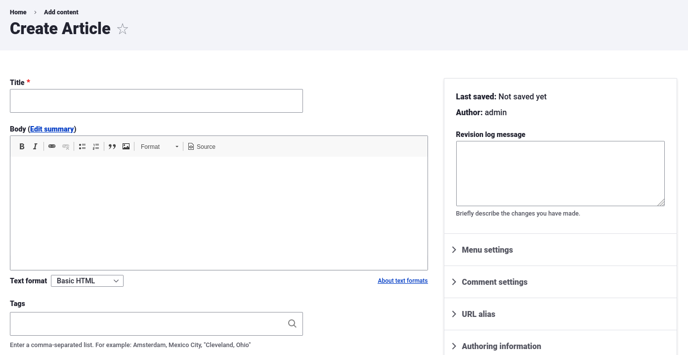
 During our Tag1 Team Talks episode, we asked Cristina to share what the most significant improvements are that she would like to see in Claro's future. Cristina responded by citing the layouts of administration pages, namely the forms and other user interface components that constitute much of the editorial experience in Drupal. After all, she asks, "who hasn't wanted to create a node edit form that places something on the right sidebar?" This question is pressing not solely because of the possibilities such layout manipulation would unlock but also due to the fact that developer-friendly administration themes are typically the only way for Drupal users to heavily influence the layout of administration pages in Drupal.
Whereas in other content management systems this requirement might be considered superfluous, in Drupal it is a basic need, as this functionality has been available for quite some time to developers. Cristina also envisions an experience that would allow even greater flexibility by offering users the flexibility to determine a particular layout depending on the content on which an editor is currently working. Due to Drupal's high degree of customization when it comes to content types and their fields, node edit forms could feasibly have anywhere from two to forty fields that, especially in the latter case, test the limits of what is possible within an administration theme's design. In many scenarios, the person who decides how the content model should appear is the site builder, rather than the Drupal community enforcing a rigid approach to content modeling.
Simplifying complex user interfaces
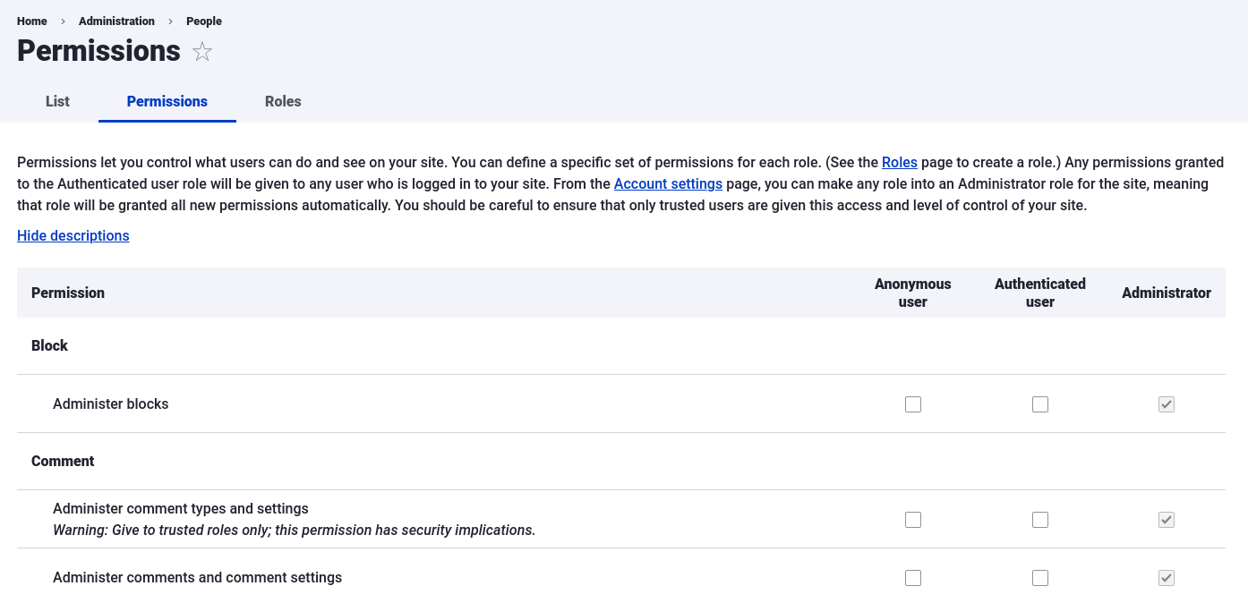
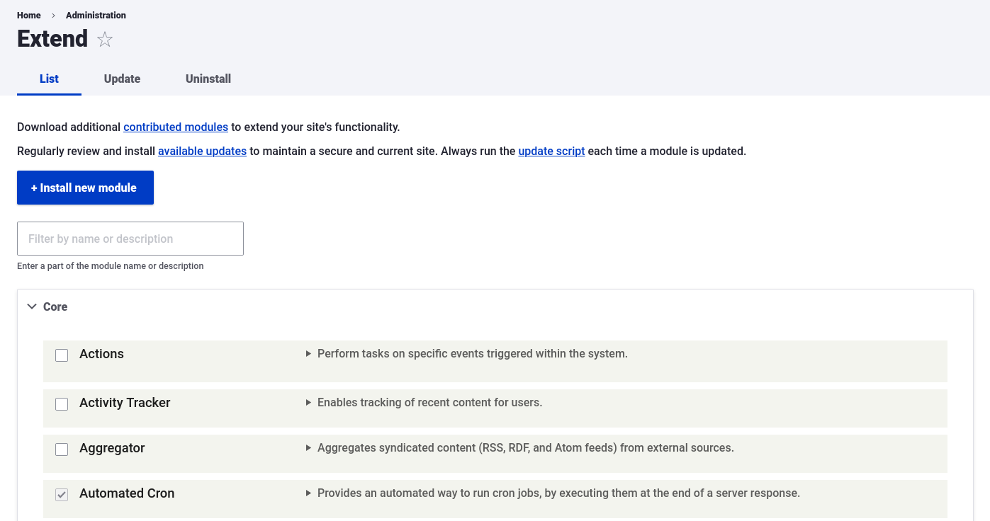
 Revamping the appearance of certain user interfaces in Drupal that have reputations for being overly complex is also a key roadmap item for the Claro theme. Views UI, for instance, is regularly cited as one of the most challenging and incomprehensible user interfaces in Drupal despite its powerful strengths. Other pages, such as the modules list page and the user roles and permissions page, are robust for a small number of modules or user roles but quickly become noticeably unwieldy as soon as the list reaches dozens or hundreds of items. Though there was an attempt to redesign these pages in the past, much of the work did not move forward due to the monumental amount of work involved.
Cristina also discusses the prospect of many of these complicated user interfaces becoming initiatives in their own right, and she recommends that motivated contributors add to the Ideas queue to make them a reality and find other interested parties. The first step, in Cristina's view, is to examine the user interface's requirements and determine from there the next best steps to realize ambitious experiences that include JavaScript-driven interactivity and modern design patterns.
A dream state for Claro?
 One of the questions we posed to Cristina during our Tag1 Team Talks episode had to do with what her ideal vision for Claro would look like — what is the dream state for Claro? Cristina responded by recommending a distinction be made between Claro and the concept of modernizing the administrative interface, as Claro has more of a focus on the aesthetic renewal of the administrative interface rather than enabling snazzy features like JavaScript-driven interactivity and animations. Now, concludes Cristina, "we can focus on the rest of the things we'll need."
To make Claro stable for the next release of Drupal, a substantial amount of work remains, but beyond that milestone, the Claro team is interested in pursuing an exploration of how Claro's components could work in complex environments like Views UI and other similar interfaces on Drupal's docket. Stress-testing Claro's components would also enable those components to target more of the foundational cases that user interface developers need, in addition to underpinning initial development of redesigned interfaces. Cristina's hope is that many in the Drupal community view Claro's components as a robust foundation on which diverse user interfaces can be implemented.
Why Drupal is a perfect place for UI development
Cristina argues during our Tag1 Team Talks episode that "Drupal is the perfect place to do lots of things from the UI perspective." And the vision she shared with us in the previous section is only one step on the way to an ambitious future state for Drupal. Cristina shares that she wants to see not only two- and three-column layouts but also JavaScript-driven interactions that are commonplace across the web these days.
WordPress's Gutenberg project has served as a valuable source of inspiration for Claro's architects, but Cristina acknowledges that many of Gutenberg's goals are not viable in the Drupal context due to Drupal's emphasis on modular and structured content that does not match Gutenberg's more full-page approach. For example, Cristina argues that having a drag-and-drop Gutenberg-like user interface on a content entity in Drupal with only five fields could be overkill for the node's requirements. Nonetheless, one of the most compelling next steps for Claro and other front-end modernization efforts in Drupal could be to facilitate several different ways of editing content based on its characteristics.
In the end, Drupal's focus on experimentation is part of what makes the community and ecosystem so rich. Experimenting with new user interfaces and new ways to interact with content is key to the success of any application, and Drupal's administrative interface is no exception. By shedding some of the anachronistic approaches implemented by the Seven theme, Claro represents an exciting next stage in Drupal's front end and user experience. Cristina concludes by restating the primary purpose of Drupal's administration layer: not to be a fancy front end but to provide the most robust solutions possible to manage content in an efficient way.
Conclusion: How to get involved
The Claro administration theme is an exciting new development for Drupal core, and I'm excited to see how users respond across a variety of use cases and personas to the biggest update to Drupal's administrative interface in quite some time. But best of all, you too can get involved in Claro's development and propose and contribute your own ideas. All conversations about Claro take place in Drupal's Slack organization. Design considerations are discussed in the #admin-ui-design channel, whereas the larger-scale work around revamping the administrative interface is centered around the #admin-ui channel. For discussions about JavaScript and its role in driving richer interactions, the #javascript channel has seen discussion around this topic. These channels are the most direct way available to communicate with other contributors online.
As for Drupal.org, Claro has its own component in Drupal core, searchable in issues on Drupal.org and assignable to issues that you create. In addition, the initiative's coordinators are not only active and prolific but also friendly and approachable. Lauri Eskola (lauriii) and Cristina attend Drupal events regularly and also are available at many times on Drupal's communication channels. As for me, I plan to apply the Claro administration theme to the editorial interfaces on my own personal site. Thanks to the Claro theme, Drupal enters a new decade with a modern look and feel and a carefully considered approach that evokes the best of open-source communities: deep collaboration and thoughtful innovation.
Special thanks to Cristina Chumillas, Fabian Franz, and Michael Meyers for their feedback during the writing process.
Photo by Rachel Ren on Unsplash

