Part 1 | Part 2 | Part 3 | Part 4
Table of Contents
What is Claro?
--The origins of Claro
--Setting Claro's goals
Claro's objectives
--Improving the site builder experience
--Improving Drupal's information architecture
Conclusion
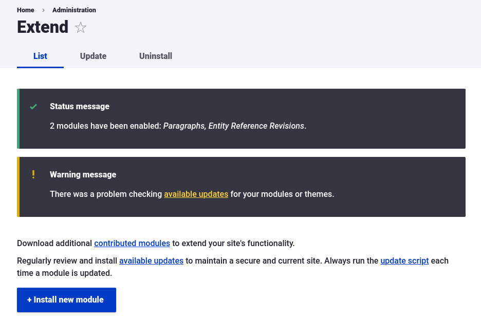
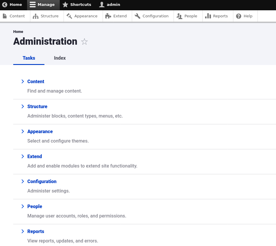
Drupal has been around for a long time, and its content editing interface has undergone several refreshes over the years, most notably during the Drupal 7 development cycle with the Seven theme. Another administration theme is rapidly changing the game for Drupal site builders and content editors, and it's part of a Drupal core strategic initiative—one of the Drupal community's utmost priorities and innovation streams—to modernize the front end of Drupal for a variety of use cases. Claro is a new administration theme available for users of Drupal 8 that focuses its attention on usability, accessibility, and extensibility.
Your correspondent (Preston So, Editor in Chief at Tag1 and author of Decoupled Drupal in Practice) had the opportunity to host a Tag1 Team Talks episode spotlighting the Claro theme with Cristina Chumillas (Front-End Developer at Lullabot), Fabian Franz (Senior Technical Architect and Performance Lead at Tag1), and Michael Meyers (Managing Director at Tag1). In this multi-part blog series, we take a closer look at Claro and some of the lesser-known considerations that went into its design, development, and wide adoption by Drupal content creators and editors alike the world over. In this first installment, we cover the history and goals of the Claro administration theme.
Later blog posts in this series delve into a variety of Claro topics. The second installment deals with how Claro found inspiration in modern design patterns and its design process. In the third installment, we explore how Claro focused on enabling accessible user experiences while remaining as innovative as always. In the fourth and final installment, we discuss the future of Claro and how you can get involved as a contributor.
What is Claro?
The Claro administration theme is part of the JavaScript and Admin UI Modernization initiative, one of Drupal's core strategic initiatives that originally began as two separate initiatives. One devoted its attention to improving the JavaScript developer experience in Drupal core, and the other was focused on advancing the user experience in Drupal's editorial layer. Several years ago, the two initiatives joined forces and merged because the missions were largely the same for both: modernization of the interfaces that undergird all user interactions with Drupal content creation.
The origins of Claro
Claro was the result of several usability studies conducted across a variety of subjects and concentrated feedback from marketing teams and from Drupal evangelists responsible for selling Drupal to customers. Though Claro itself is not an initiative, the opportunities presented by a new editorial interface are so significant that discussion has begun about whether to spin the Admin UI and JavaScript Modernization initiative into multiple initiatives with a shared focus but differentiated goals.
As an idea, Claro began in 2016, but earnest discussion began at DrupalCon New Orleans, where several key contributors began to conduct conversations about the increasingly urgent need to refresh the user interface. At DrupalCon Vienna, later that year, work on refreshing the user interface kicked off, with contributors from initial discussions joining forces in the form of multiple birds-of-a-feather (BoF) sessions and design sprints during Contribution Day. As it so happened, the JavaScript Modernization initiative also occurred at the same time, with the stated goal of replacing the user interface entirely and refreshing all of Drupal's internal JavaScript.
Setting Claro's goals
 After considerable discussion, the Admin UI and JavaScript Modernization initiative team reunited at Frontend United 2018 to set goals for the new editorial interface. Cristina recalled during our discussion that creating goals as a team was uniquely challenging due to the dual concerns of substituting the Drupal 8 user interface with a single-page JavaScript application at the same time as redesigning the user interface. Add other constraints such as limits on scope and timelines, and you have all the ingredients for a difficult discussion.
The Claro team analyzed several usability tests and surveys in the Drupal community that consulted more than three hundred participants. Among the many pieces of feedback the contributor team heard was the clear opinion shared by many Drupal users that the user interface of Drupal seemed outdated in appearance. After all, the previous large-scale redesign that had occurred in Drupal's history resulted in the Seven theme, a robust and forward-looking design upon its creation, but by the time the survey was created, Seven had been in Drupal core for a decade. Seven also needed a refresh not only in terms of design language but also when it came to obsolete user interaction patterns.
Other complaints that Claro contributors heard during the discovery process highlighted the complexity of certain authoring interfaces. Certain contributed modules were not yet created when Seven was approaching its release, most notably the Paragraphs module, which in addition to facilitating the creation of arbitrary lists of fields also allows those "paragraphs" to be nested within one another. It was clear that a comprehensive redesign of the administration was needed, and this was the first time the notion of Claro as its own entity emerged.
Claro's objectives
The goals that Claro's architects set had to touch not only on all of the distinct personas in Drupal, like the site builder, developer, and content editor; they also needed to ensure technical heft as well as increasingly nonnegotiable requirements like accessibility and usability on multiple devices. Fortunately, the Claro team was able to identify a set of objectives that would not only be achievable but also be meaningful to the community as well as the ecosystem.
For one, the Claro team recognized early in the process that embracing JavaScript more deeply or leveraging more component-based approaches was an impossibility due to time constraints and a lack of volunteers. Because replacing the Drupal user interface with a JavaScript application would require infrastructural modifications in addition to a wholesale evolution in Drupal's own front-end approaches, the initiative focused on the administration theme first and foremost in order to allow additional time APIs necessary for a hypothetical JavaScript-driven interface to emerge.
Improving the site builder experience
Drupal is one of the few examples among content management systems of a user experience that provides for the site builder persona, which doesn't exist in other ecosystems. However, site builders make up a sizable proportion of the Drupal community, as analyzed surveys indicated, and their needs could not go ignored. In the Drupal ecosystem, the site builder is generally considered an administrator with exclusive permissions. And any content editor, especially those who spend eight hours every day editing content, will use the same tools as a site builder to create pages.
One of the other often confounding aspects of Drupal is the fact that roles and permissions have an outsized influence on how the user experience functions across personas. For instance, the local action tabs at the top of every administration page in Drupal are configured in such a way that certain users without special permissions may not see particular menu items, thus curtailing access to certain key locations in Drupal.
Improving Drupal's information architecture
Drupal's information architecture was also found in user experience surveys to be confusing for content authors. Because the Claro team found this during one of its initial usability tests, contributors ended up focusing more time on the content author experience, and one of the goals became creating a new menu for content authors and adding a new user role to Drupal known as editor, content editor, or content author. This proposal is still under discussion on Drupal.org.
A month into the development cycle, the Claro team found that while fostering an improved content author experience would yield considerable dividends for Drupal's longevity and user experience, the site builder experience could not be ignored due to many user interfaces' position at the nexus of both personas. For instance, the Views UI and Paragraphs modules are considered optimized for site builders who need to structure content in addition to writing it, but these modules today are both commonly manipulated by content editors as well.
Conclusion
Thanks to the efforts of the Claro team, Drupal 8 now has a refreshed editorial interface that is not only uniquely modern and resolutely ready for new expectations of user experiences, but also demonstrates careful attention lent to the diverse personas that constitute the Drupal fabric. The Claro administration theme has a rich history with foundations in the JavaScript and Admin UI Modernization initiative, but like the best open-source projects, it has since morphed into a formidable initiative in its own right and a conduit for the formation of other prospective initiatives. Claro's goals also meshed tightly with myriad usability studies and user surveys conducted across Drupal's community to confer even greater robustness to the team's efforts.
In this blog post, we examined some of the underpinnings of Claro that has led to its incredible progress and evolution over the past several years and its humble beginnings as a series of discussions at Drupal community events. We also analyzed some of the motivations and goals that drove the design and development of Claro, including considerations for personas like site builders and content authors, technical evaluations of the viability of leveraging JavaScript, and scrutiny on usability tests and community surveys that yielded substantial fruit for contributors to ponder. In the second installment of this multi-part blog series, we dive into the inspiration behind and design for Claro.
Special thanks to Cristina Chumillas, Fabian Franz, and Michael Meyers for their feedback during the writing process.


